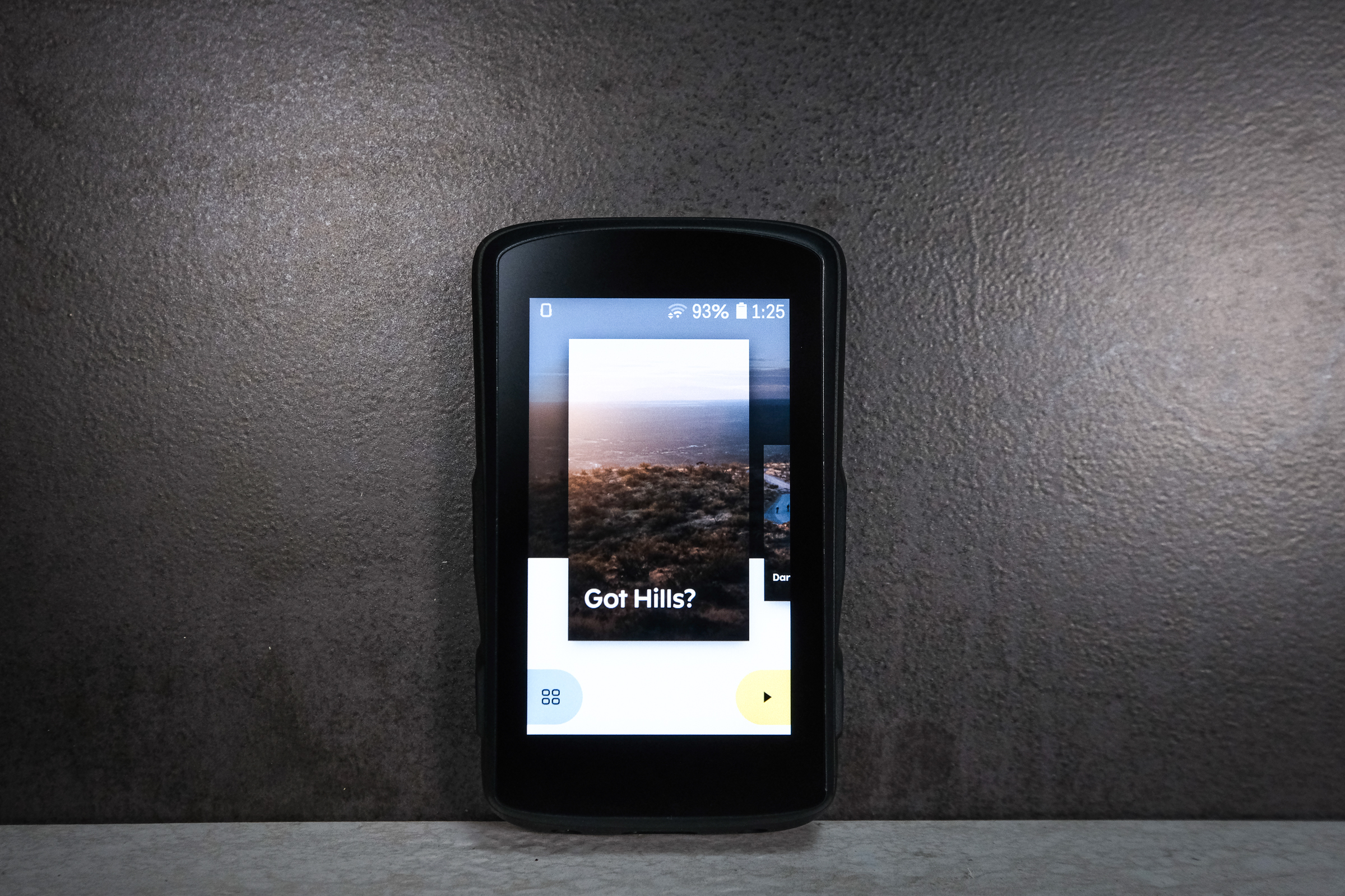
Hammerhead’s introduction into the GPS head unit game was not an easy one. The original Karoo was up against the Garmin behemoth, and the up-and-coming Wahoo lineup. But Hammerhead’s pitch was a big, beautiful screen and advanced mapping.
Fast forward to the Karoo 2’s introduction and Hammerhead faces a different landscape altogether. It now has the opportunity to not only steal a bit of market share, but also transcend the competition with its updated mapping features, hardware, and usability.
As such, the Karoo 2 features heaps of nifty features that I outlined in my “Lemme See That!” product rundown here.
Ultimately, Hammerhead has a true competitor in the GPS space on its hands. There are some quirks, but what head unit doesn’t have that? The Karoo 2 feels streamlined and exceptionally usable after a brief learning curve.
Price:
Star Rating: ★★★★☆
What I like: Touchscreen is bright, colorful, and generally excellent; you can disable the touchscreen and use the tactile buttons in inclement weather; menus and user experience all function more easily than Hammerhead’s competitors; navigation and routing works wonderfully
What I’d change: USB-C waterproof seal isn’t attached to the unit, so it falls out and gets lost almost immediately; battery life is just okay; on-the-fly changes to navigation could be much easier, since WiFi or cellular data is currently required to do this
My call: An excellent competitor to other units in the GPS class, the Karoo 2 feels high-end, streamlined, and exceptionally easy to use. It’s not perfect and could use some better phone-to-GPS capabilities, but it’s certainly among the top of a growing crop of navigation units.
Hammerhead Karoo 2: The Build
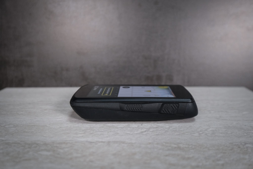
Photo: Dan Cavallari | DawnPatrolMTB.com
For most of the details of the Karoo 2 build, be sure to check out our “Lemme See That!” article and video. We outline specs, functionality, and more.
The quick and dirty: the Karoo 2 got slimmed down significantly from its predecessor. It’s now more closely the size of a Wahoo Elemnt Roam. The Karoo 2 features a full-color screen with touchscreen capabilities. There are also buttons on the sides of the unit so you can navigate the computer without using the touchscreen.
Getting started with the Karoo 2 is fairly quick and easy. But you’ll probably have to update firmware right off the bat when you take the unit out of the box. You’ll also need to set up WiFi, and while it’s not necessary to get going with the unit, you’ll probably want to set up a Hammerhead account so you can get the most functionality out of the Karoo 2.
My advice is to spend a bit of time with the Karoo 2 before you throw it on the bike and go. This will improve your user experience. Hammerhead touts the on-the-go capabilities of the Karoo 2, which are indeed impressive. But you’ll want to learn them while you’re standing still first.
The Karoo 2 comes with a pretty unique mount that took me quite a long time to get used to. It’s slim and aero, which is cool. And mounting the computer to it is easy: just pull it into place. Removing it is slightly trickier. You pivot it to the side and then pull. But very often I ended up hitting one of the side buttons during this operation. Sometimes that meant turning the Karoo 2 on when I didn’t mean to.
Still, it’s a nifty system and overall I like the package. The mount itself is plastic, and I would be excited to see some aftermarket CNC aluminum designs. These appear to be forthcoming, as I spotted a sleeker unit on Chris Froome’s bike at the 2022 Tour de France.
Hammerhead Karoo 2: Navigation, sensors, and screens
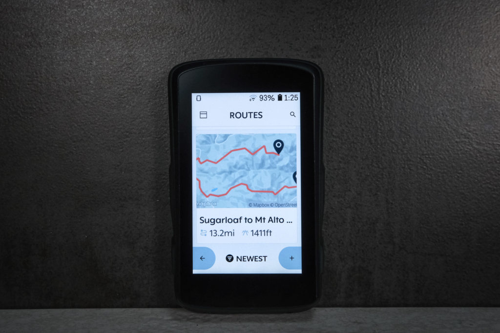
Photo: Dan Cavallari | DawnPatrolMTB.com
I like my GPS head units to be as grab-and-go as possible. In that sense, the Karoo 2 is quite easy — much easier than setting up a Garmin, though perhaps not as quick as setting up a Wahoo computer.
The screens can be changed and adjusted to your liking on the fly. And it’s easy to do so. No digging in menus, just a few clicks of a button. Pairing your devices is likewise quick and easy. Once set up, you can use the Karoo’s built-in ride profiles to get going on your ride quickly. If you’d rather not pair anything, just click start and get pedaling.
The navigation features took a bit of figuring out. I started pedaling without doing any real research into the Karoo 2, and that was a mistake. For starters, I couldn’t figure out right away how to get to the navigation screen I wanted. And I couldn’t figure out how to use the mapping feature that lets the rider enter a destination while riding. (More on that in a moment; turns out I should have read the manual first!)
Once I got that straightened away by linking my Karoo to my Hammerhead dashboard (dashboard.hammerhead.io), everything went a lot more smoothly. You can upload routes easily from the dashboard, though keep in mind that you’ll need WiFi or cell signal to make the transfer.
Riding with the Karoo 2
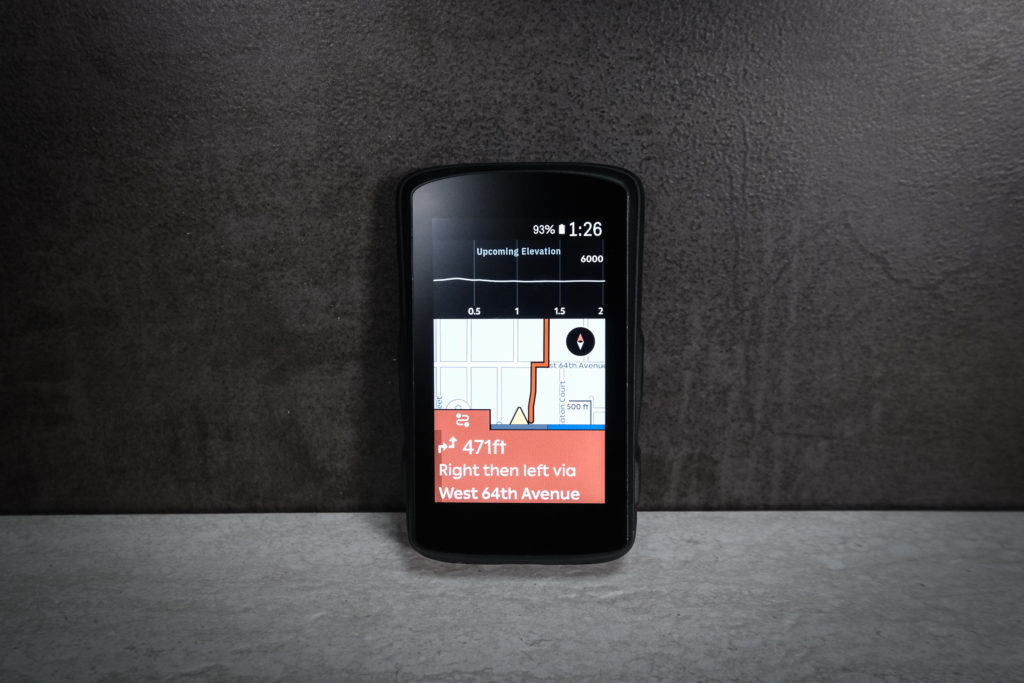
Photo: Dan Cavallari | DawnPatrolMTB.com
I’ve ridden with the Karoo 2 for a few months now, both at home and while covering the Tour de France in Copenhagen. After lots of rides, I’ve come to like the Karoo 2’s navigation capabilities quite a lot. It’s not a perfect unit, but it’s got enough going for it that it has become my go-to unit.
That’s largely because of the user interface. It’s easy to navigate and change menus, even on the fly. But I would not recommend doing so using the touchscreen. It takes your attention away from the road or trail in front of you for too long. Fortunately, you can use the external buttons to navigate screens quickly.
I used pre-loaded routes while in Copenhagen. Loading them to the unit is very easy using a computer. I wish it was a bit easier to make changes to routes on the fly without WiFi or cellular data (via Bluetooth, perhaps?). And I forgot my sim card at home, which meant I couldn’t use some of the on-the-fly features that would have come in handy while traveling. It would be nifty if Hammerhead just included the sim card, and left it up to the user to activate it…or something to that effect.
The Karoo 2’s navigation cues happen quickly — much more quickly than other units I have tested. That meant I didn’t miss any turns because the unit lagged behind my speed. And the maps are incredibly detailed. I loved being able to pinch zoom in and out to get a better sense of where I was, and where I was headed.
One bummer: no reverse route feature. I often had the forethought to create routes from my AirBnB in Copenhagen to the destination I wanted to reach. But I just as often forgot to load the reverse file. It would be great to be able to do this on the fly.
The Climber Feature lived up to my high expectations. I sure do love being able to see all that climb data at a quick glance, in bold colors. It did indeed help me pace myself up climbs, know when to jump, and otherwise understand what was ahead.
While the Hammerhead website advertises best-in-class battery life for the Karoo 2, I found it to be just okay. Battery life of course depends on what features you are using, what power savings features are activated, what weather you’re riding in, and more. But generally, the battery did seem to fade quicker than expected. Hammerhead says you should get 12 hours of ride time in normal conditions with the medium battery drain recommended configuration. That didn’t seem likely in my experience. Nine to ten hours seemed more likely.
Final Word
The Karoo 2’s sleek, colorful package combines excellent navigation with a streamlined user experience. I would like to see an easier way to upload and change routes in real time. And Hammerhead could focus on improving battery life and charging time. But largely, the Karoo 2 exceeds expectations with wonderful features like the Climber screen, full-color and zoomable mapping, and lots of storage.
This review was first published on our sister site, Slowguyonthefastride.com.

